--- Case study ---
Redefining Camden Art Centre’s Digital Presence
Produced for
Effect Digital
Camden Art Centre is an iconic cultural institution, known for its thought-provoking exhibitions, artist residencies, and educational workshops. As part of a rebranding project led by Pentagram, I was tasked with translating their meticulously crafted visual identity into a responsive, user-friendly website. This project required an innovative approach to creative problem-solving and seamless collaboration across multiple teams to ensure the digital presence reflected Camden’s reputation and values.
I led the website design process, collaborating with Pentagram’s branding team, developers, and stakeholders at Camden Art Centre. My responsibilities included understanding the brand guidelines, identifying challenges specific to digital platforms, and designing an adaptable, engaging, and accessible user experience.
While Pentagram’s brand guidelines were comprehensive and beautifully executed, adapting them for a digital space came with unique challenges:
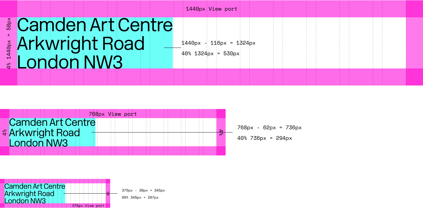
Translating strict proportional rules for margins, logos, and typography across multiple devices and screen sizes.
Creating a cohesive visual system while maintaining flexibility for various content types.
Ensuring accessibility and usability without compromising on creativity or the brand’s artistic vision.
Innovating within brand constraints to enhance the digital experience.
To kick off, I immersed myself in Camden’s brand guidelines through workshops with Pentagram. Their team provided valuable insight into the visual identity’s principles and intent. Alongside this, I conducted:
Analytics Review: Using Google Analytics, I identified the most common devices and screen sizes used by Camden’s audience, allowing us to prioritise key breakpoints.
Competitor Analysis: I examined other leading art centres and galleries to benchmark best practices for digital design in the sector.
Stakeholder Input: Conversations with Camden Art Centre stakeholders clarified their objectives and expectations for the new site.
Consistency across devices was critical, but flexibility was needed to avoid rigidity.
The brand’s core visual elements—typography, logo, and colours—needed careful adaptation to retain their essence while enhancing usability online.
Users needed a clean, intuitive interface that aligned with Camden’s minimalist physical space and allowed its art to shine.
My approach centred on balancing creative ambition with practical functionality. I adhered closely to the brand guidelines while introducing subtle refinements for the digital medium. Collaboration with developers and Camden stakeholders ensured every decision aligned with both brand identity and user needs.
Design choice 01.
By prioritising popular screen sizes identified through analytics, I worked with developers to scale margins proportionally, ensuring harmony across desktop, tablet, and mobile.
Design choice 02.
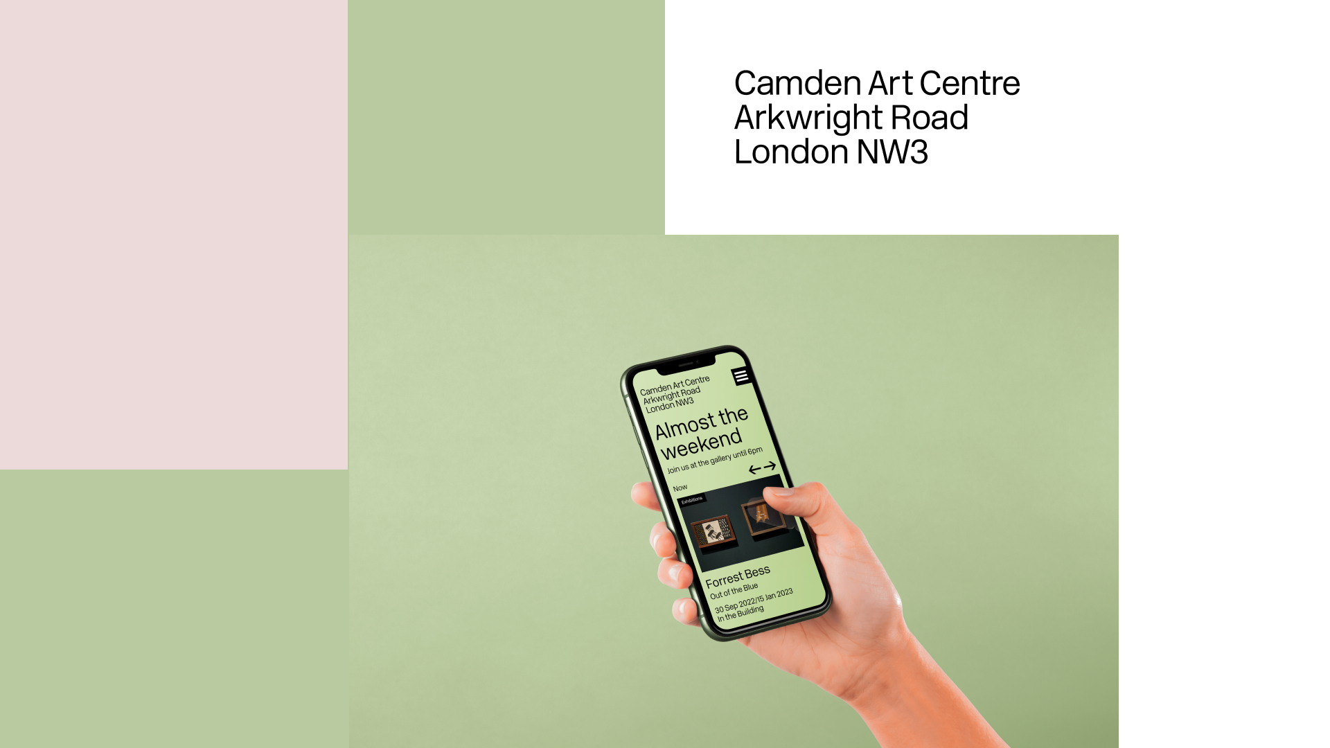
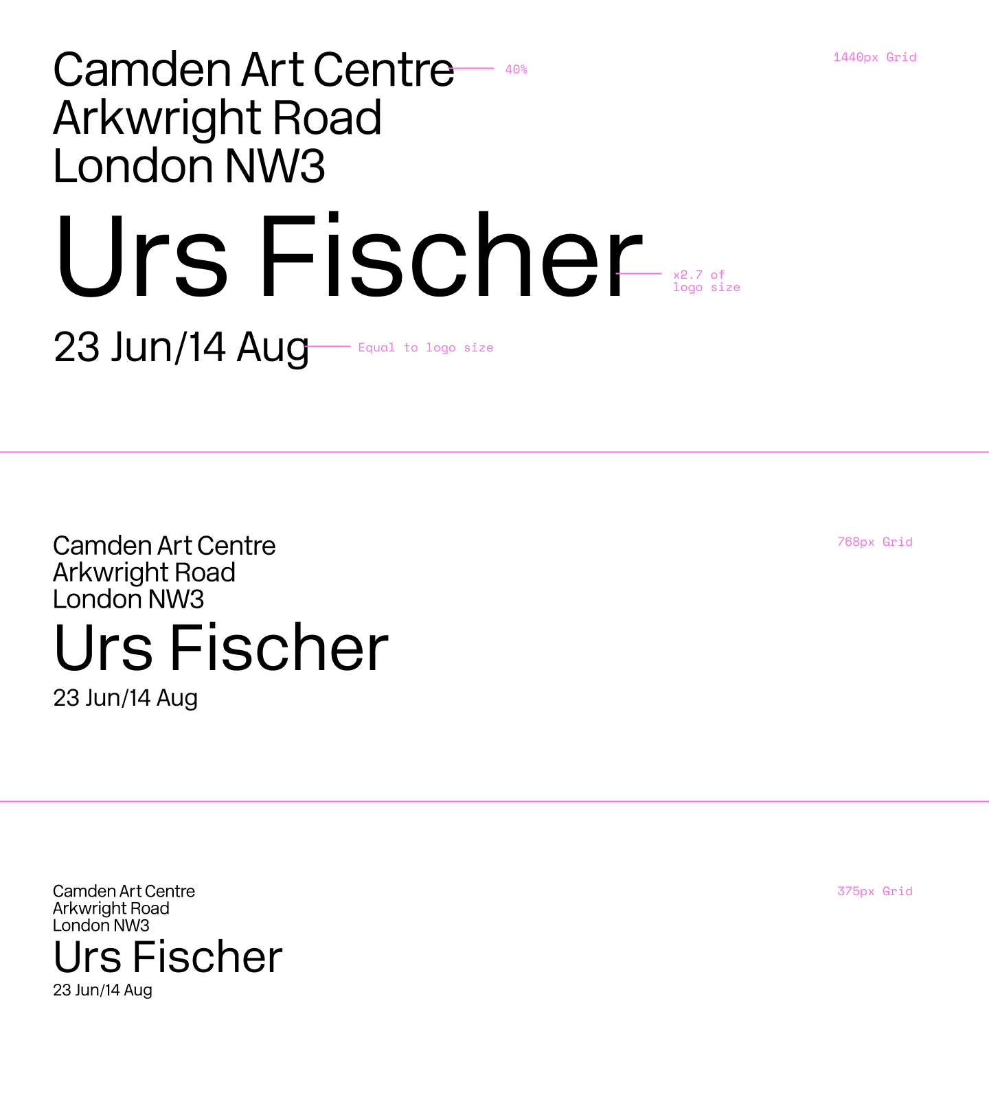
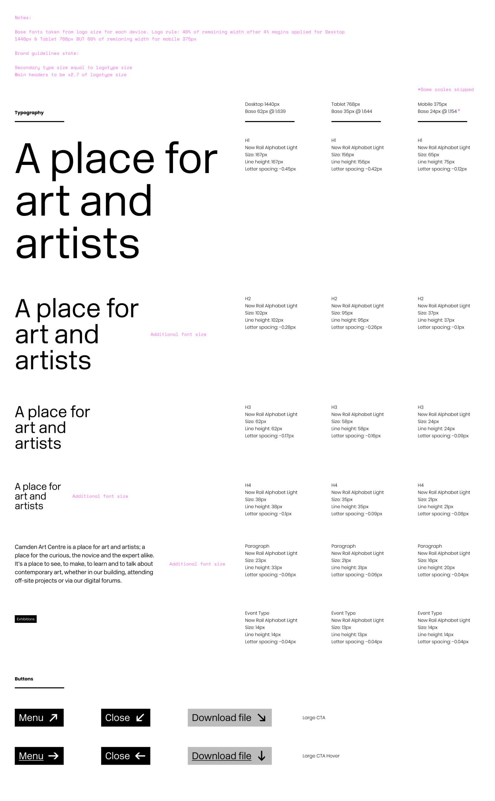
A consistent 40% logo scale was applied for larger screens, while mobile used 60% to enhance readability. This ensured the logo remained prominent yet unobtrusive.
Design choice 03.
To reflect Camden’s visual identity, I introduced the Divisional Fade System. This tool scans featured images and generates two contrasting colours for typography and backgrounds, ensuring every page feels cohesive while maintaining accessibility.
Design choice 04.
To adapt strict font size guidelines for digital formats, I developed a custom modular scale, adding two header sizes and a paragraph size for better usability. These additions maintained consistency while improving the user experience.
Design choice 05.
I designed a framework that allowed Camden to highlight its diverse content—exhibitions, workshops, and residencies—without overwhelming users. Signposts and feature images were used sparingly, maintaining a clean, minimalist aesthetic.
This project underscored the importance of collaboration and adaptability. The constraints of the brand guidelines initially seemed daunting, but by engaging in open dialogue with Pentagram and Camden’s stakeholders, we turned these limitations into opportunities for innovation. Additionally:
Starting with research ensured we made informed design choices that resonated with users.
Clear communication across teams was key to aligning creative and technical solutions.
Flexibility in approach—knowing when to adapt the rules—helped balance brand fidelity and usability.
This project demonstrated how creativity flourishes within constraints. By working collaboratively and approaching challenges with curiosity and precision, we created a digital presence that reflects Camden Art Centre’s reputation and values. The new website strikes a balance between artistic ambition and functional design, allowing the art to take centre stage.
For me, this was a reminder of the power of thoughtful design and the importance of tailoring solutions to meet unique challenges. Whether you’re an art centre, a cultural institution, or any organisation seeking to transform your digital presence, the right balance of creativity, collaboration, and research can deliver something truly exceptional.
If you’re looking for a designer who can transform your digital presence with creativity and care, let’s start a conversation.
Let’s create something exceptional together
Got an idea or a project you need my help with?
Call: +44 (0) 7780 548585
Email: hello@darrenbarrett.co.uk
Follow: LinkedIn
© 2026.
Darren Design Limited.
Company No. 15106668 (England & Wales)
