--- Case study ---
A Fresh Look for Panache
Produced for
Effect Digital
Panache Lingerie is an award-winning brand with five distinctive lines catering to a wide range of body types, offering sizes up to a K cup. With over 40 years of experience in delivering comfort, style, and fit, Panache has built a trusted reputation in the lingerie space. However, its digital platform had fallen behind modern user expectations. A full redesign was commissioned to bring the site in line with its brand values and deliver a stylish, user-centric shopping experience.
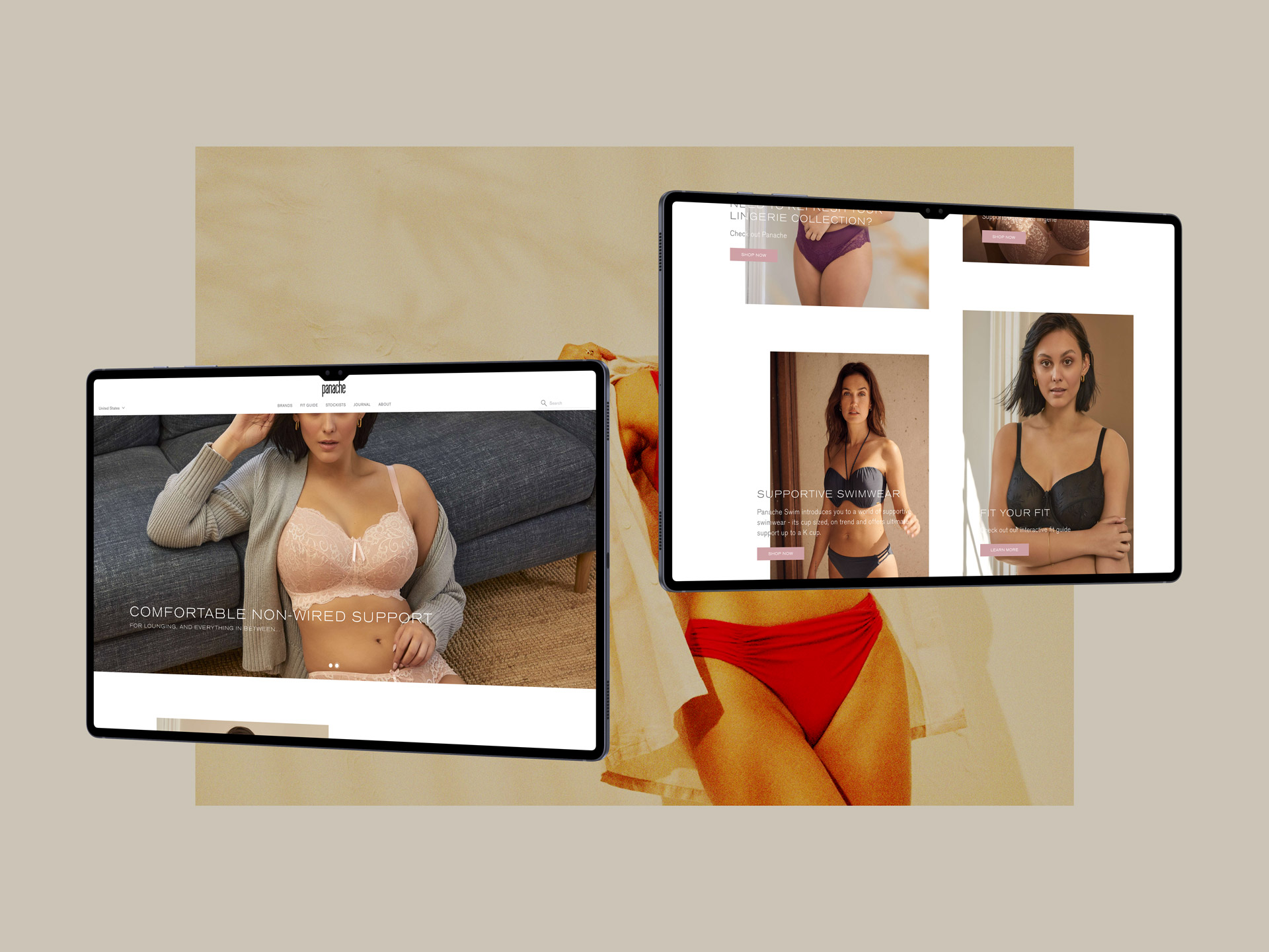
I led the UI design across the entire eCommerce platform—translating the new brand direction into an accessible, digital-first experience. My work included mapping user needs, generating responsive prototypes in Figma, and collaborating with stakeholders and developers. Creativity, accessibility, and community engagement were key drivers in every design decision.

The previous site suffered from a clunky interface, disjointed user journeys, and limited support for discovering the right fit, an essential component for lingerie eCommerce. Product pages lacked the depth and quality needed to convey craftsmanship, and visual clutter diluted the brand’s premium positioning. The challenge was to distil the brand’s identity into a sleek, engaging digital experience that served its diverse audience effectively.
The discovery phase revealed key friction points in the user journey—cluttered pages, a confusing checkout process, and a lack of intuitive guidance. Customer insights highlighted a strong emotional connection to the brand, a reliance on fit information, and appreciation for visual storytelling. We also benchmarked leading fashion and lingerie eCommerce platforms to identify best practices and usability patterns.
Users needed clearer size and fit information to reduce uncertainty.
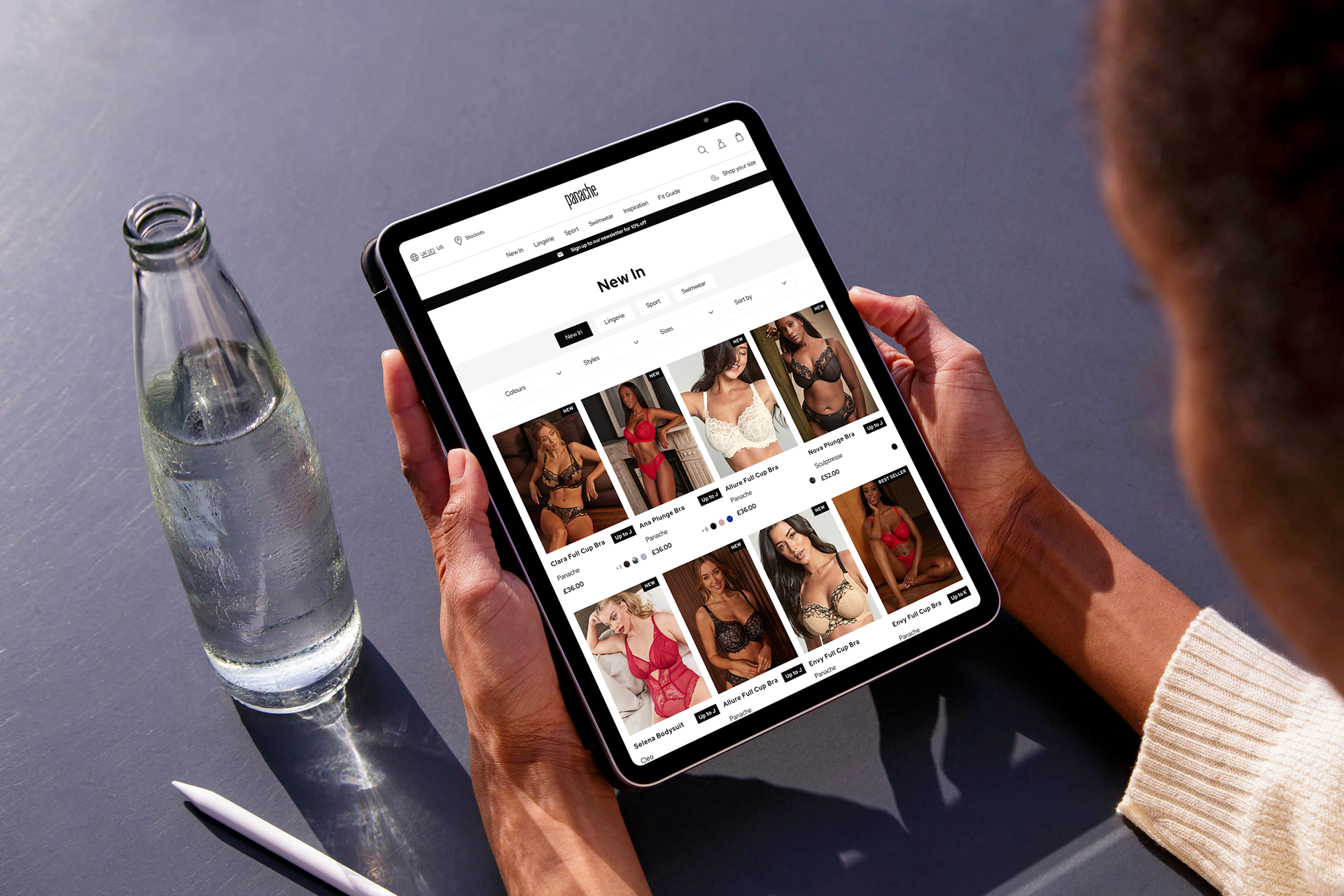
A simplified layout and better filtering would improve product discovery.
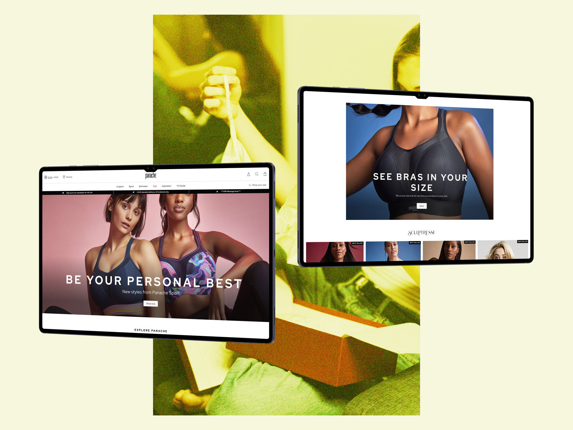
Social proofing and personalisation were important for confidence and trust.
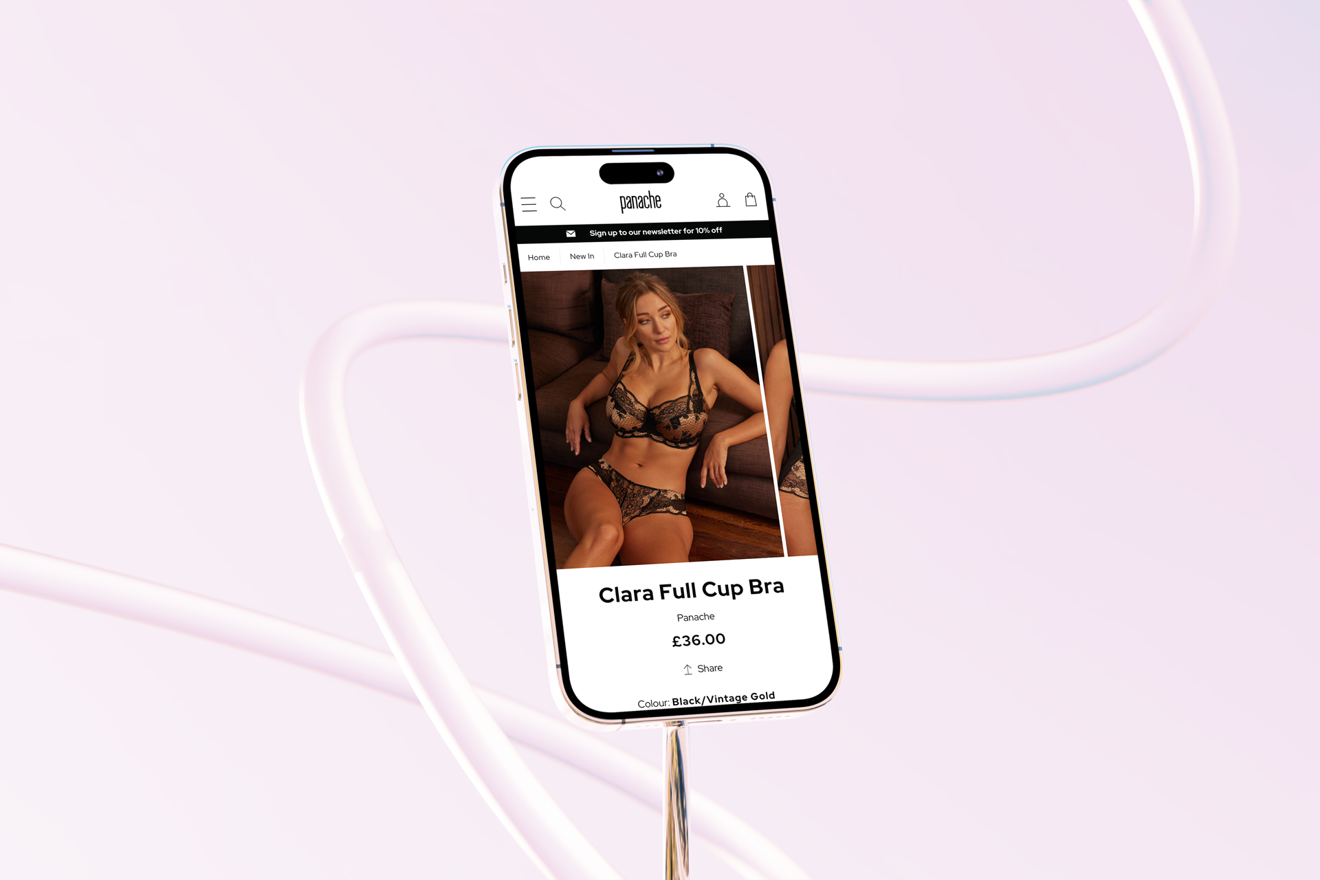
Large, high-quality images helped communicate product quality and style.
Working collaboratively with the internal team, I led the UI design process—from low-fidelity wireframes through to high-fidelity prototypes in Figma. A stripped-back visual style placed emphasis on product photography, creating a more immersive and editorial feel.
Design choice 01.
A super-minimal design language that aligned with Panache’s stylish and confident tone.
Design choice 02.
Streamlined filtering, enhanced search, and simplified account access.
Design choice 03.
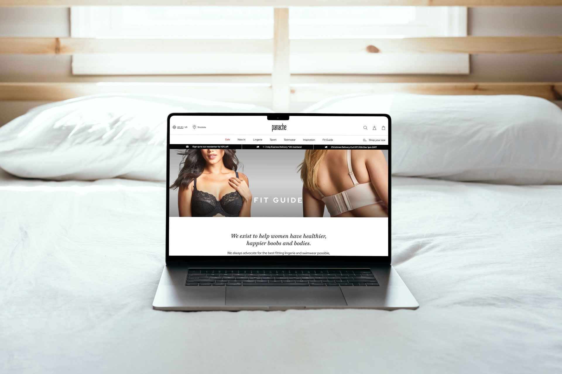
Richer, more accessible content to help users choose the right product with confidence.
Design choice 04.
Super zoom for detail, sticky add-to-basket for convenience, cross-sell modules, and reviews to provide social proof.
Less is more: Reducing visual clutter can create more impact, especially when combined with strong product photography.
Support matters: Fit guides and clear navigation go a long way in reducing user uncertainty and lowering return rates.
Consistency builds trust: A cohesive experience—from homepage to checkout—strengthens brand perception and user satisfaction.
The new Panache website reflects both the legacy and forward-thinking direction of the brand. It's a confident, stylish platform that puts the user first—balancing form and function to support both engagement and conversion.
If you're looking to elevate your eCommerce experience with a thoughtful, user-centred design approach, feel free to get in touch.
Let’s create something exceptional together
Got an idea or a project you need my help with?
Call: +44 (0) 7780 548585
Email: hello@darrenbarrett.co.uk
Follow: LinkedIn
© 2026.
Darren Design Limited.
Company No. 15106668 (England & Wales)
